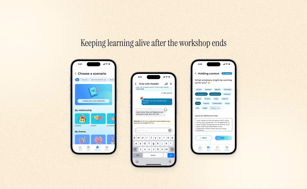
A learning app for workshop participants to practice new skills
The University of California, San Francisco (UCSF) created a training series to help teachers become more trauma-informed. Research showed that professional development must be sustained over time to have the most impact on students, so the team wanted to explore ways to support continuing education for workshop participants. I joined the project during the exploratory phase and led the ideation and design of the app.
MY ROLE
User Research
Interaction Design
Visual Design
Prototyping
TEAM
1 Product Designer (Me)
Workshop Psychiatrist
DURATION
1 Month
THE PROBLEMS
No support for participants after the workshop ends
⏰ Developing new skills takes time
Repetition and practice are critical to retain information long-term.
👁️ Unable to measure how successfully the training is taught to other staff
Each school sends 3-5 teachers to attend the workshop. But it's up to those participants to determine if and how they share what they learned with the other teachers.
STAKEHOLDER INTERVIEW
Requirements & constraints
After speaking with my stakeholder, I compiled a list of requirements and limitations to keep in mind.
REQUIREMENT
Continued practice
The app should help users practice what they learned during the training.
REQUIREMENT
Maintain nuance
In real life, there is no singular right or wrong way of handling situations.
CONSTRAINT
Limited resources
UCSF can’t provide staff to support further trainings, and technical requirements should be kept simple.
USER RESEARCH
What teachers value: Quick lessons, realistic advice
Due to privacy concerns, I wasn’t able to interview actual workshop participants, so I conducted five user interviews with teachers and caretakers as proxies.
Keep it quick; teachers are busy
We already have so many meetings, so when schools make trainings mandatory, we have even less time for other important tasks.
Realistic, not idealistic
Concepts like ‘lead with love’ don’t help us navigate real-life situations when kids aren't listening.
Navigating challenging situations
I wish I had resources to help me when I'm stuck — like a mentor to bounce ideas off of or scripts to help with difficult conversations.
A two-staged approach: Exploring both an MVP and ideal state
Since this was a proof of concept, we wanted to reflect all the possibilities, while still keeping in mind the technical limitations of a public university’s psychiatry department.
V1 — MVP
Five minute lessons
Low effort — can recycle training content
Minimal time commitment — good for busy teachers
Can be used to teach other staff
Real-life scenarios are highly varied; hard to capture all the nuance in this format
V2 — IDEAL STATE
Practice difficult conversations w/ AI
High technical requirements
AI chatbot simulates real conversations so users can gain practical experience
Personalization — tailor practice to specific problems users are facing
MVP: Five minute lessons
Concept design
I explored design patterns at various edtech companies and meditation apps to get inspiration for how to design simple, mobile-first lessons.
Unlock lessons as you go
Many education apps display lessons through a series of locked chapters, reducing overwhelm.
Minimal question screens
They keep it simple with minimalist screens with fun graphics.
User flow
LOW & HIGH FIDELITY WIREFRAMES
Putting it all together
Five minute lessons
Scenario-based lessons to help users remember and apply trauma-attuned practices learned during training.
Feature: Five minute lessons
Business goal: NPS
MVP requirement: Offer users a few potential considerations for each question; won’t be able to capture every possible answer.
Promote user engagement
Streak reminders on the home page and after each lesson motivate users to return the next day. Locked lessons help reduce decision paralysis by directing users to a specific lesson every day.
Feature: Streak + locked lessons
Business goal: User engagement and retention
MVP requirement: Streak and lesson timeline are the same for everyone; not customized based on user’s goals and education level.
Reflection
The lessons allow participants to continue practicing the concepts taught in workshop, while also introducing them to staff who were unable to attend.
Challenge: Designing text-heavy screens
As an MVP, we relied on communicating information through text over video. As a result, many screens were quite text-heavy, and I had to think through ways to break it up so as to not overwhelm our users.
What’s missing?
This Q&A learning model is limited to the answers we provide and doesn’t allow for nuanced discussions. Additionally, users aren’t able to personalize these to specific problems they are facing in the classroom.
Phase two: Exploring post-MVP iterations
Adding an AI chatbot to help users practice difficult conversations
User research showed a demand for mentors or resources to help guide teachers through difficult scenarios. While UCSF doesn’t have the staff to support real-life mentors, an AI chatbot allows users to practice trauma-attuned approaches based on the real scenarios they experience at work.
EXPLORATIONS & ITERATIONS
How to display chat tips?
While I had a general sense of how I wanted to design the chatbot, the big question was how to display chat tips and inner thoughts (i.e. insights into what the other person is thinking versus what they’re saying).
Considerations
📚 Level of education: How much help did we want to offer? Users may be coming from different levels; should we allow them to opt-in/out?
⚖️ Ease of use: How do we balance the level of education with ease of use?
🤏 Limited space: The app was mobile-first, and a significant portion of the screen would be taken by the keyboard.
Early explorations
Initially, I explored placing these features in a floating banner so users could access hints whenever they wanted.
👎 Downsides of a floating banner
The banner draws users’ eyes away from the chat. The keyboard already takes up a lot of space, leading to more scrolling for the user.
👩🏻 What do users think?
During user testing, participants found it frustrating that they had to keep clicking on the banner. They also wondered how they would be able to see chat tips and inner thoughts from earlier in the conversation.
Final decision: Intuitive design > personalization
I made the design more intuitive at the expense of reduced flexibility. I decided all users would get some form of immediate feedback via recurring chat tips if they selected the option, while keeping inner thoughts in a separate place.
This design pattern of immediate feedback should already be familiar to users, especially those who play digital games or use edtech platforms. Users should also be used to double tapping on messages for additional options; thus, placing inner thoughts here should be intuitive.
Scrapped explorations
I also explored an option for users to receive suggested responses. However, the technical challenges outweighed the benefits here, at least for an initial product. The primary goal of the feature was to allow users to practice difficult conversations in a more real-world setting, and we didn’t want to be too prescriptive since there are no right or wrong responses.
Final product
Closing thoughts
I love the mission of the TAP program, so this was an exciting project to work on. However, limited resources and competing priorities have delayed additional work on this product. Still, I was able to think through some design challenges I hadn’t experienced before and took some important takeaways from this project.
🤏 Working with limited screen space
Designing a mobile chat product required creativity to use the limited space effectively, especially when the keyboard took up almost half the screen.
💭 Defining an MVP
I learned how to work under strict resource and technical constraints, while leaving space to explore future iterations.
🪦 Don’t be afraid to kill your darlings
The final design of the AI chatbot ended up looking a lot different from the original explorations after receiving some crucial user feedback.