Background
With the book market dominated by Amazon, which currently holds an estimated 50%+ share of print sales in the U.S., it’s more important than ever that independent bookstores have a strong online presence. Green Apple Books’s website leaves a lot to be desired, and as a fan of the bookstore, I wanted to create a conceptual redesign focused on improving the user experience and visual design.
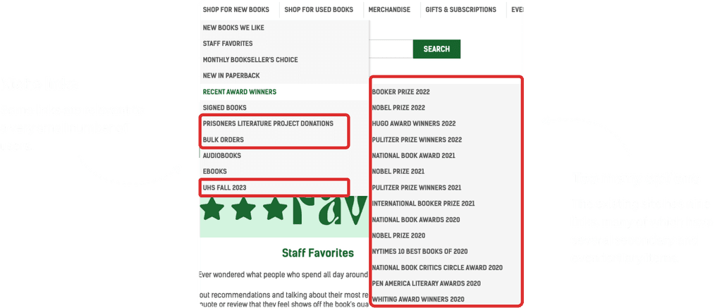
Screenshots from the original Green Apple Books website
Business goals
To narrow the scope of the redesign, I brainstormed some business goals to use as my north star.

Update graphics and modernize the website

Improve the browsing experience

Increase revenue from online sales
OBSERVATIONAL STUDY
Identifying opportunities for improvement
I conducted five observational studies to understand how users interacted with the website and identify any areas of confusion or dissatisfaction. The feedback received fell into three categories:
User expectations unmet
5/5 participants mentioned areas of the website that had unexpected design patterns (e.g., sidebar placement on the right), lack of affordances (e.g., links, rotating hero image), and extra steps (e.g., not being able to select pick up in-store option on product detail page, lengthy checkout process).
Cognitive overload
5/5 participants indicated feeling overwhelmed by the large blocks of text on several screens, as well as poor site hierarchy.
Poor and outdated UI
3/5 users pointed out examples of outdated visuals, including old social media icons, script fonts that were hard to read, and broken Instagram image links.
While most feedback focused on areas that needed improvement, a few users mentioned liking the homey feel that Green Apple Books's website gave off, compared to the more sanitized look of larger businesses. I initially struggled balancing this feedback with my efforts to improve the UX because I found that the poor design actually helped give it a more "mom and pop" vibe. But I conducted a competitor analysis to get inspiration from both larger chains and independent bookstores.
COMPETITIVE ANALYSIS
Competitive analysis
I looked towards chain and independent bookstores with online presences, as well as publisher websites and other e-commerce stores for inspiration.
Chain bookstores and large e-commerce companies were better at optimizing for the browsing experience with the goal of converting visitors to customers or upselling more purchases, but their sites could be more generic and boring. And while indie bookstore sites tended to have more personality and a "local" feel, often poor UX was a contributor to the quaint impression. I took the best of both worlds to my redesign.
Chains & larger retailers: They utilized horizontal and grid product displays to make it easy for customers to discover books, lots of white space, and minimal color.
Indie bookstores: They showcased photos of their storefronts for a more local feel.
Getting started: Creating a new sitemap
A common pain point that users noted during my observational studies was that the navigation bar was too overwhelming.
I created a new sitemap that reduced the number of primary and secondary links and eliminated tertiary links altogether. I grouped new and used books together, and decreased the number of book lists to ones users were most interested in, based on direct feedback from my observational studies.
Early concepts
I created some mid fidelity wireframes to get initial feedback, focusing on the user journey from browsing for books on the home page to the checkout screen.
HIGH FIDELITY WIREFRAMES
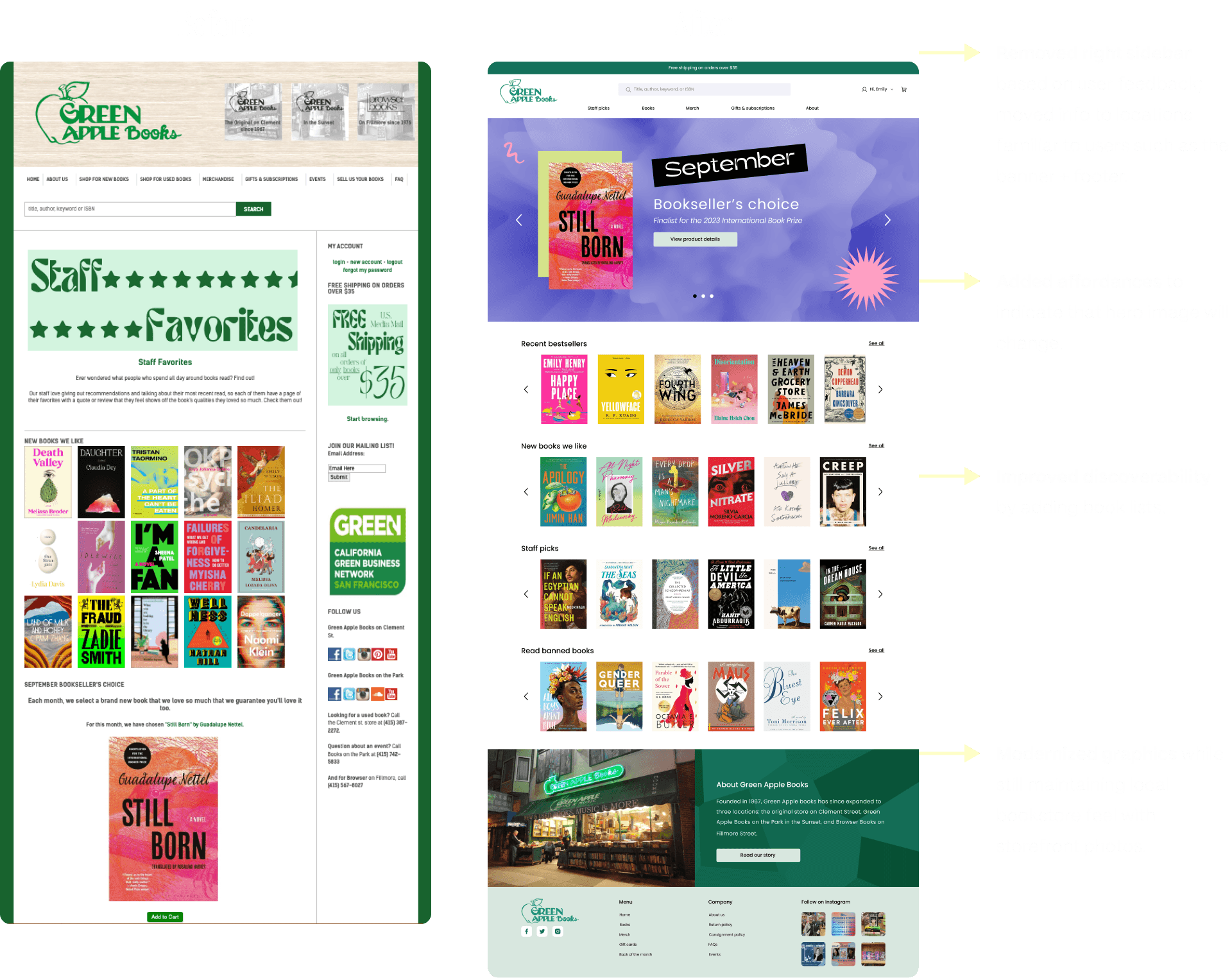
The redesign: before and after
Now for a closer look at some of the design changes that I made.
Home page
Users felt overwhelmed with all the images and text on the original home page and indicated not knowing what the key takeaways should be. I improved the site hierarchy and updated the visuals to suit a more modern audience.
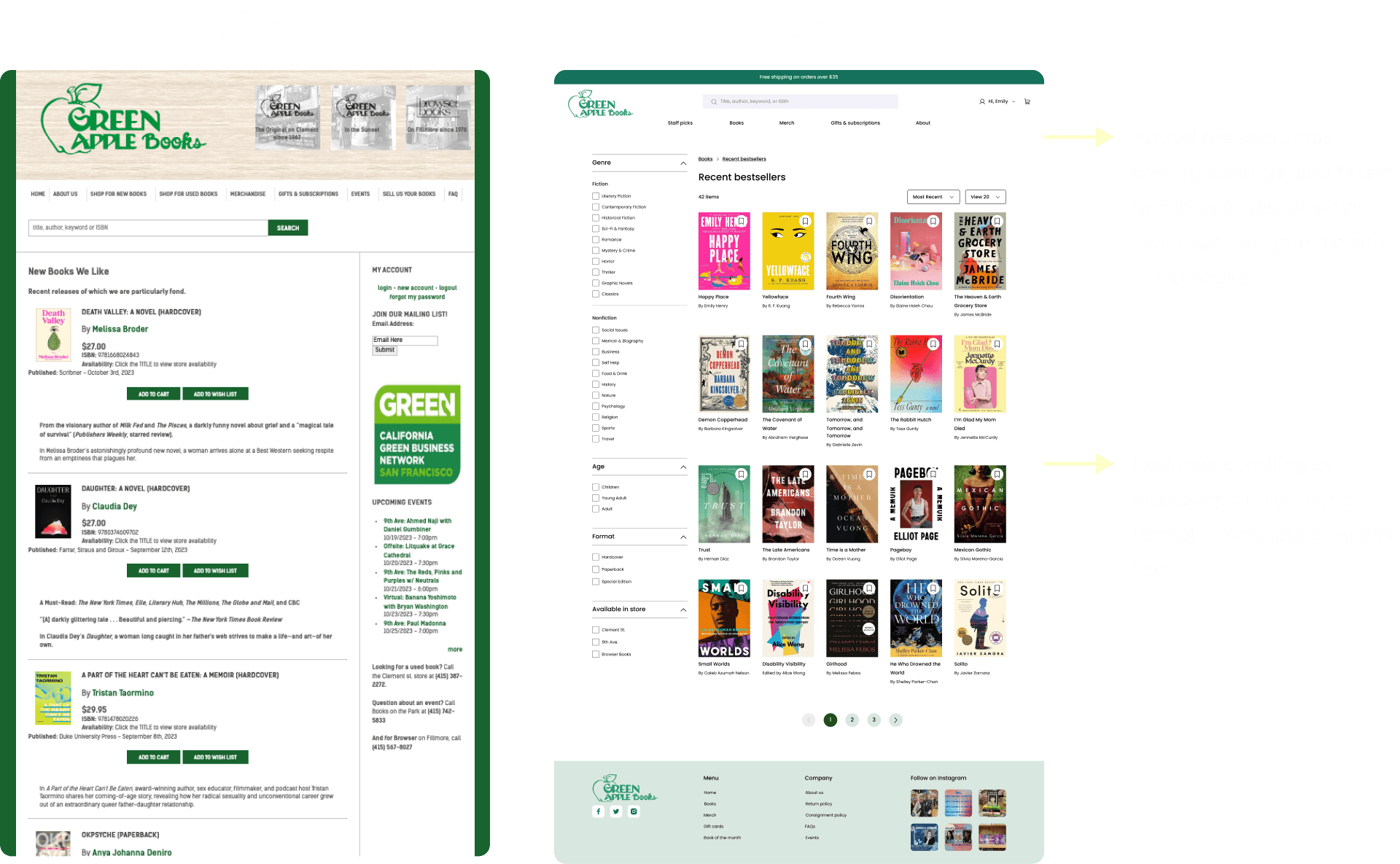
Explore page
Research participants indicated dissatisfaction with the existing book lists, citing the need to keep scrolling to see more books. I emulated the common grid design pattern of e-commerce sites to show more books on one page and added sort and filter options to improve ease of use.
Product detail page
4/5 participants had a hard time finding the pick up in-store option, which is currently located in the checkout flow. I moved it to the product detail page, improved the way information is displayed, and added other book recommendations to increase potential online sales.
Added to cart notification
Modals tend to be disruptive and don't allow much room for information and user options.
Checkout
100% of research participants noted the poor checkout experience due to too many steps and large, overwhelming blocks of text.
Post-usability test iterations
I conducted six moderated usability tests to see how users interacted with the redesigned screens. I gave them a series of tasks to test if they could figure out how to start the video, send a reminder, and use basic video functions. I also showed them multiple versions of a few screens to get feedback on which they preferred, as well as asked for generalized feedback on the visual design and UX.
Reflection
The biggest challenge I faced during this redesign was maintaining Green Apple Books's local bookstore feel without sacrificing good UX. While a couple participants of the initial observational study appreciated the homey aesthetic of the original website, I ultimately determined that it was more due to poor design and antiquated visuals—common among other indie bookstores I looked at—than anything else.
In the end, I chose to go with a more modern style, taking inspiration from larger competitor bookstores and other e-commerce sites, as it was one of the north stars I had originally mapped.
I decided that the risk of potential customers exiting the site prematurely due to a poor browsing and checkout experience outweighed any potential benefit of a more local bookstore feel could provide. But to help maintain some of the original website's personality, I kept a section on the home page focused on the history of the store, with a photo of the Clement Street location.


